Brand Design
semblances of identity
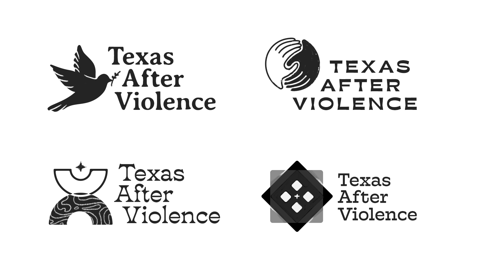
Texas After Violence Project
Texas After Violence was a community-based documentary project covering the stories of state-sanctioned violence on individuals, families, and communities.
The client requested a more hand-drawn look and feel for the logo. I chose to illustrate shapes representative of peace, community, and our stories being woven.

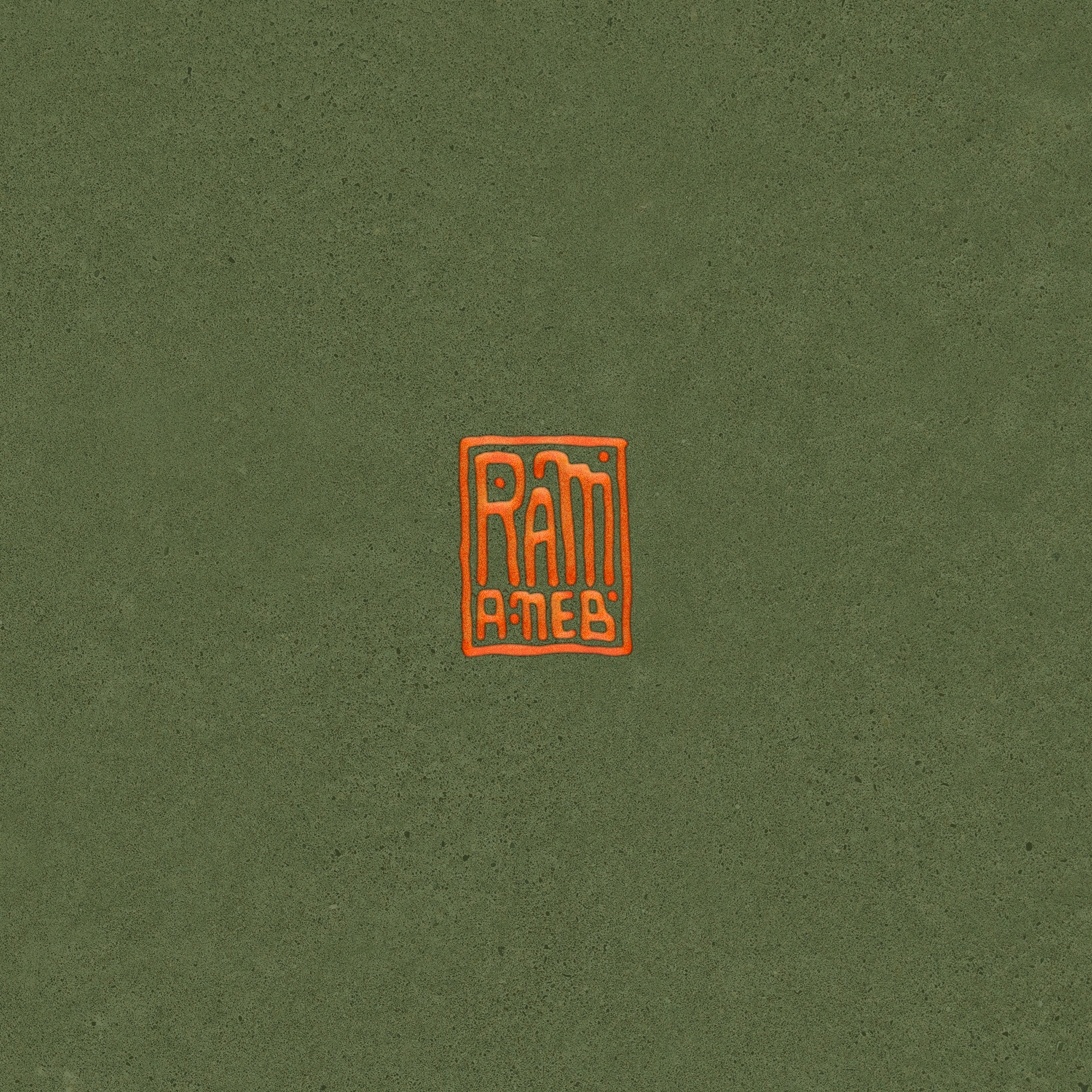
No Good Tattoo
No Good Tattoo is an Austin-based tattoo shop featuring artists, championing the tagline “for every body”.
This logo batch shows my second draft of concepts—initially moving in the direction of a wordmark logo. The client was compelled to move into a logo with imagery. The imagery requested contained arches, vessels, and hands.

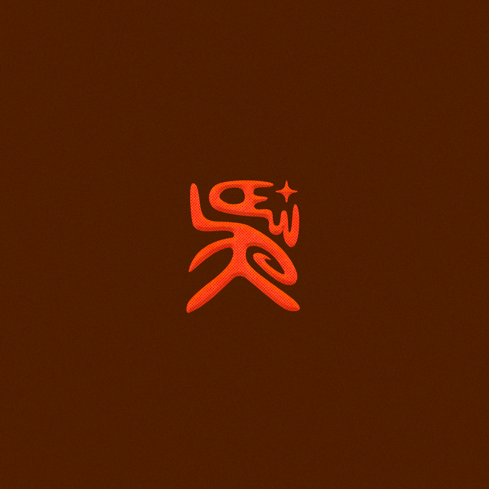
Pier Park project
The Pier Park Project is a collaborative luminasonic project by the visual artist GIIIVENS and composer Eli Kahn.
It was imperative that I captured the sonic aspect of by the hand-drawn lines in the arched form, mirroring the “tunnel” feel of the light installation.
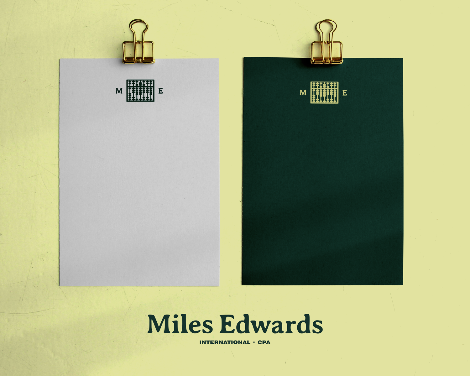
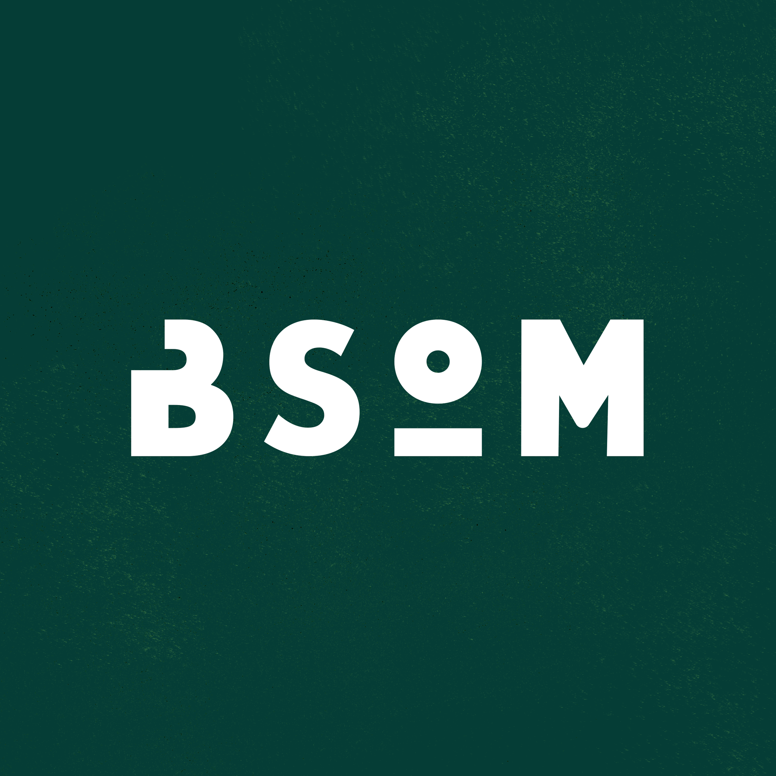
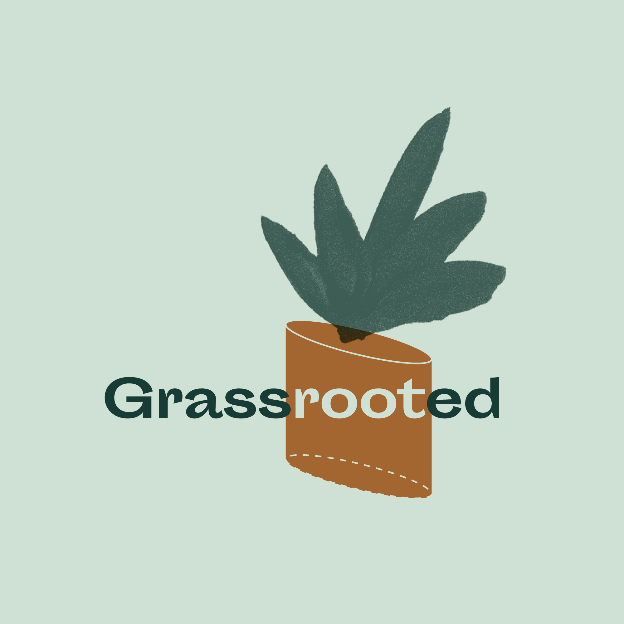
miles edwards cpa
Miles Edwards CPA is a licensed CPA and life friend. I have the honor of developing the accounting business brand with Miles.
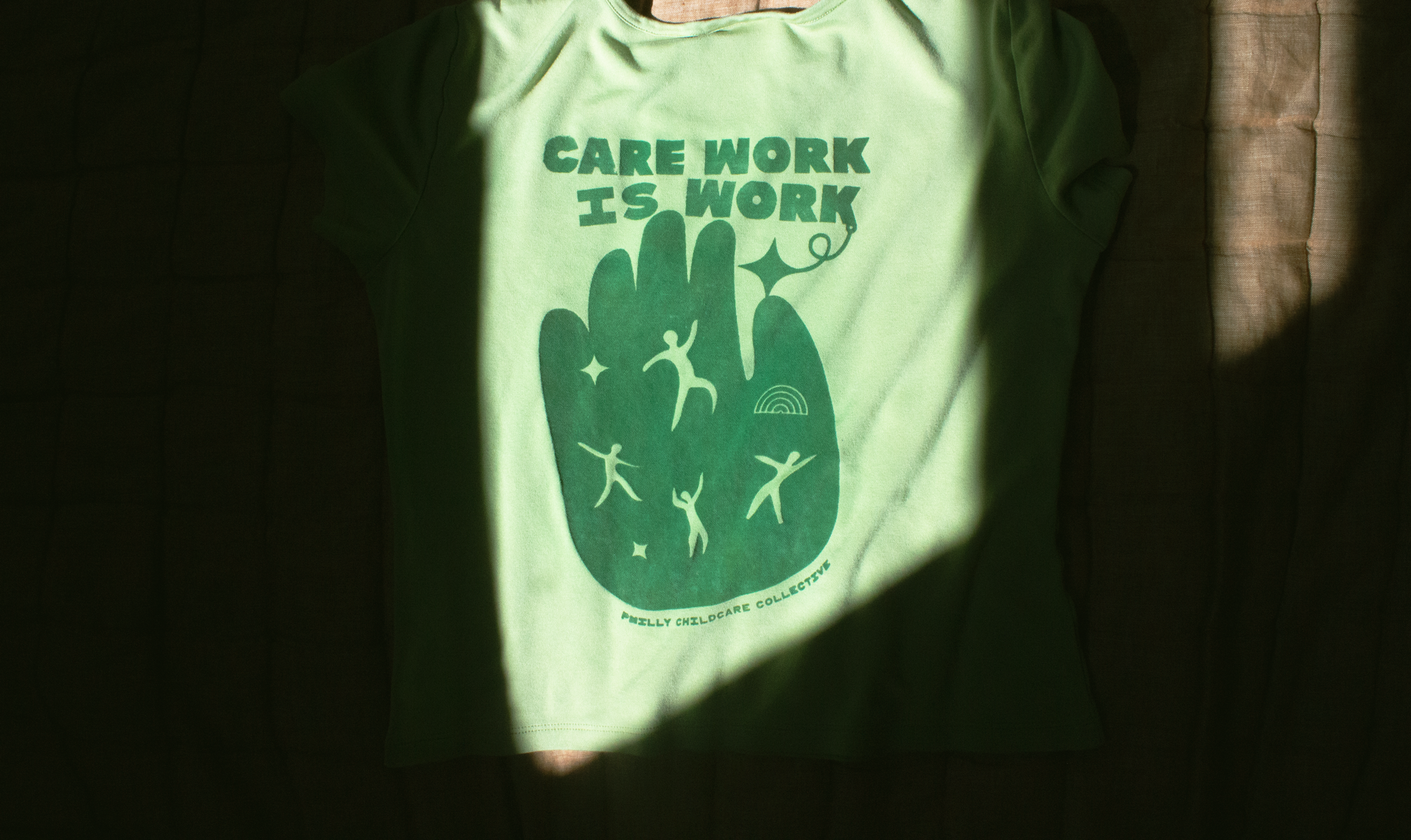
We formerly ran an art collective donned Brown State of Mind, centering brown and black creativity. To maintain that strength in Black/African identity, we continued with the red, green, and yellow hues that remained muted enough to showcase legal text at the forefront.
Visit his website to inquire about his work or to view more of my brand design work.
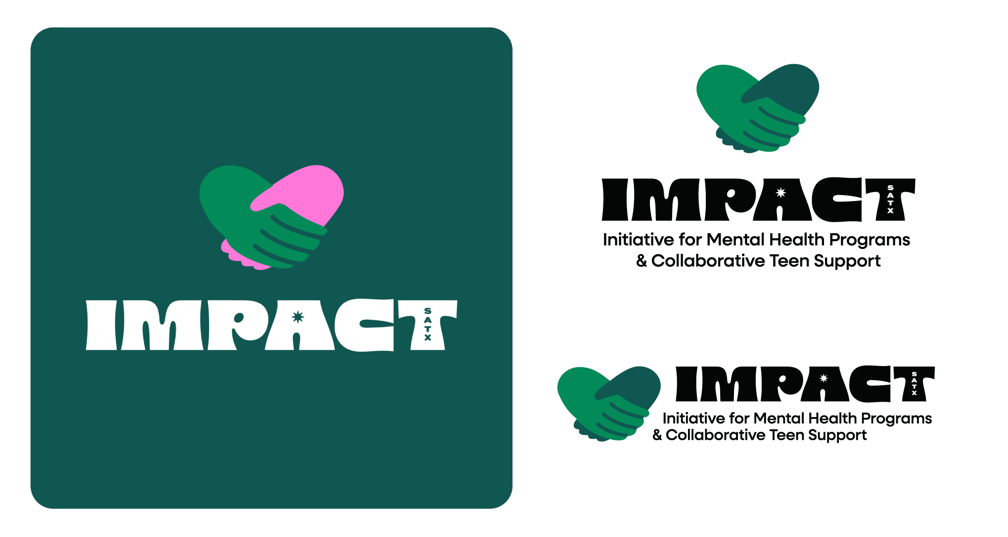
Impact satx
Impact SATX is a mental health initiative for teens & families in San Antonio, TX.
‘Impact’ is a heavy word that needed the balance of excitement and fun to appeal to the youth—incorporating curly indents and the notable San Antonio spur star. For imagery, I gravitate towards hands in a heart shape to symbolize care.

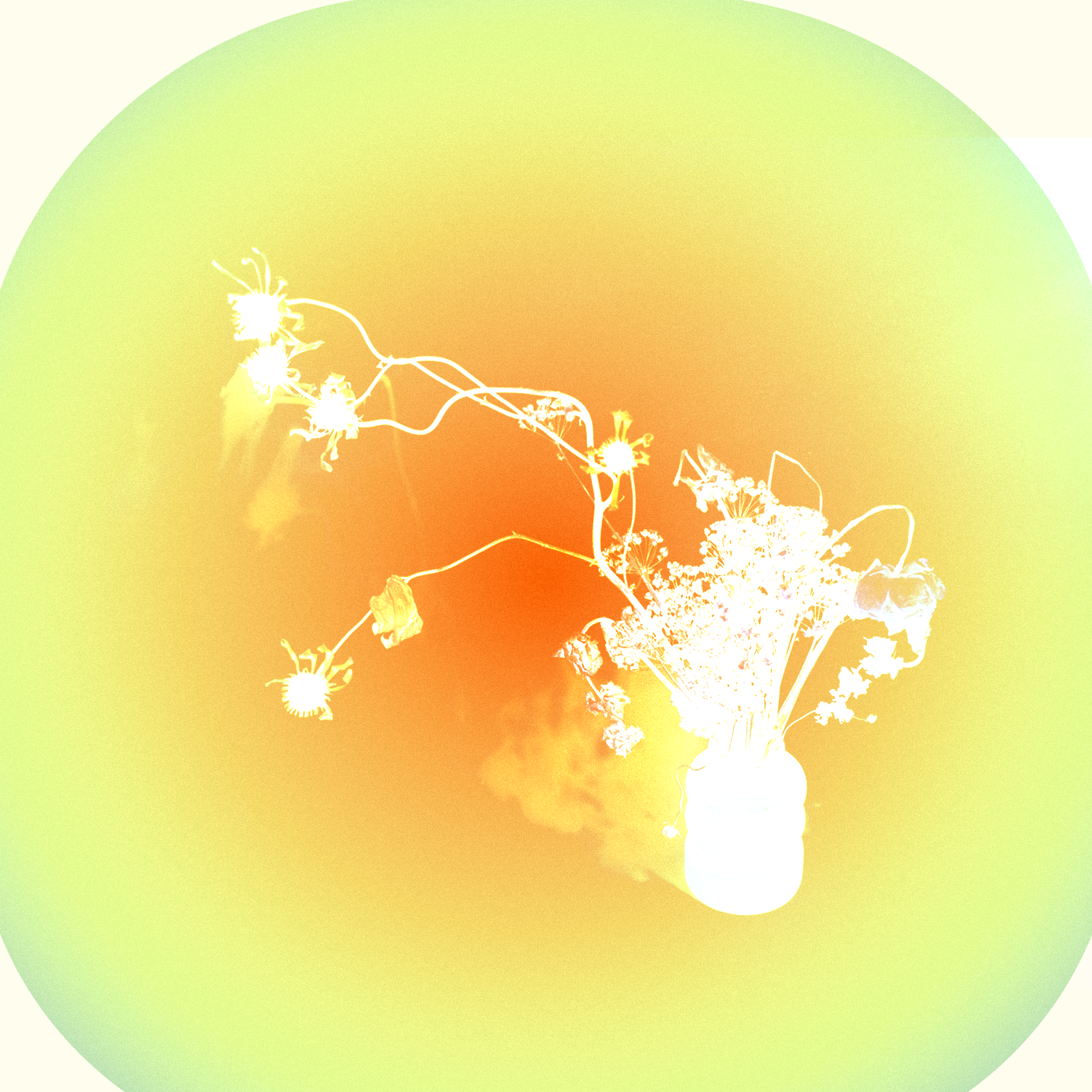
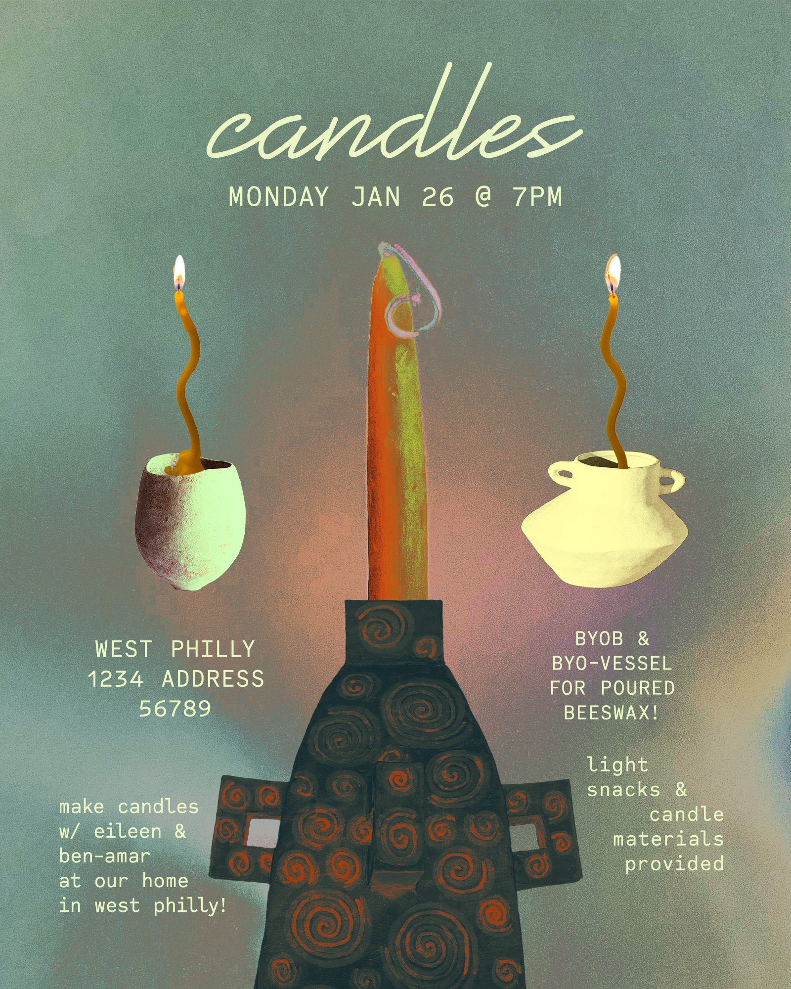
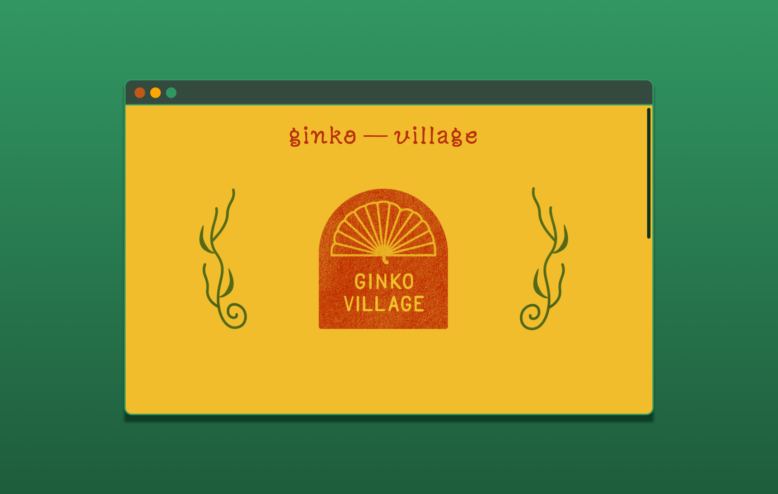
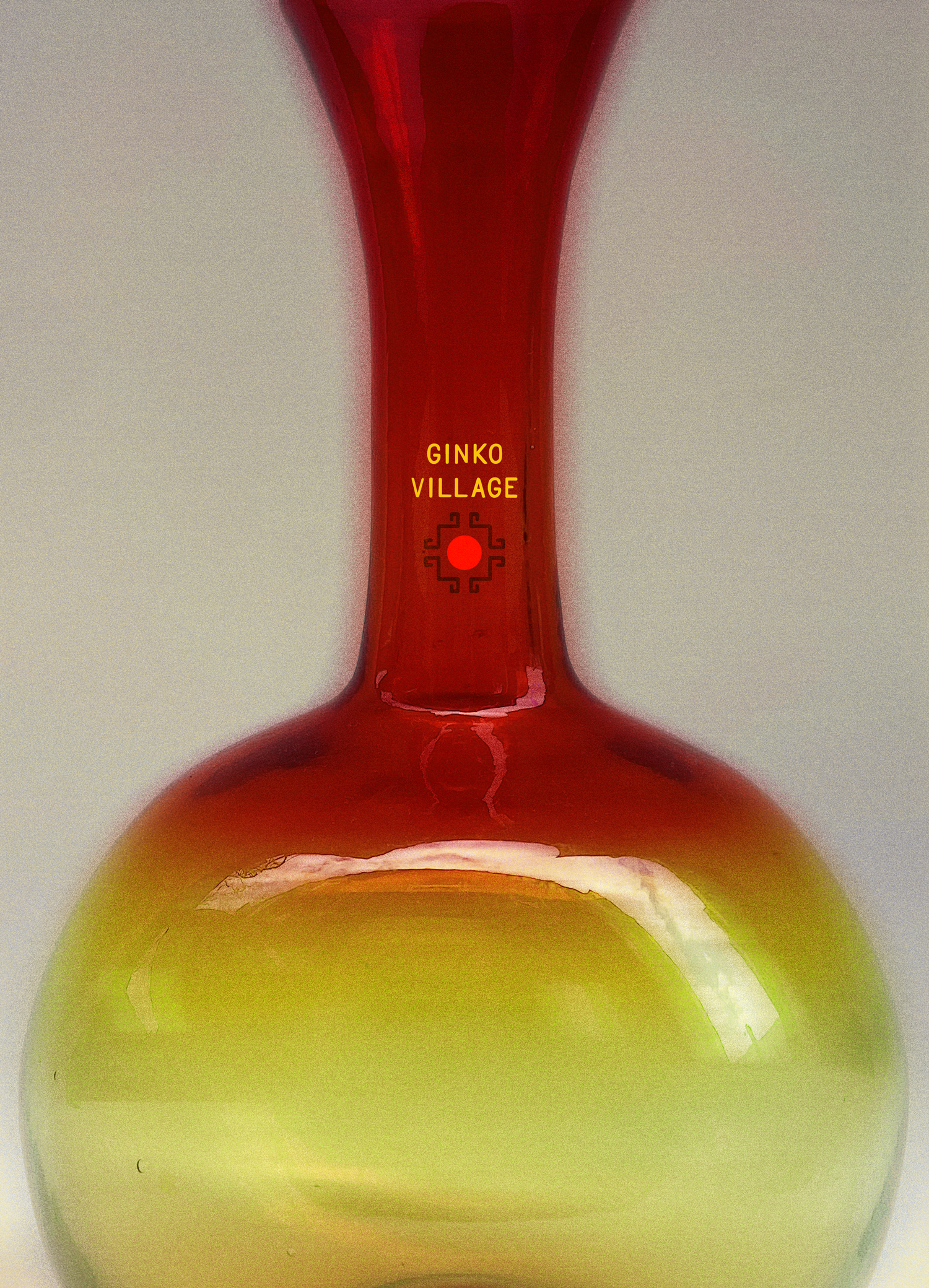
ginko village
Ginko Village is a brand concept for a general goods shop in West Philadelphia.
Ginko Village aims to bring organically crafted and sourced belongings at accessible rates for everyone to build home wherever they go, inspiring the color palette to imbue exploration and play, erring on the visual familiarity of products we’d see at grocery stores or the village market.
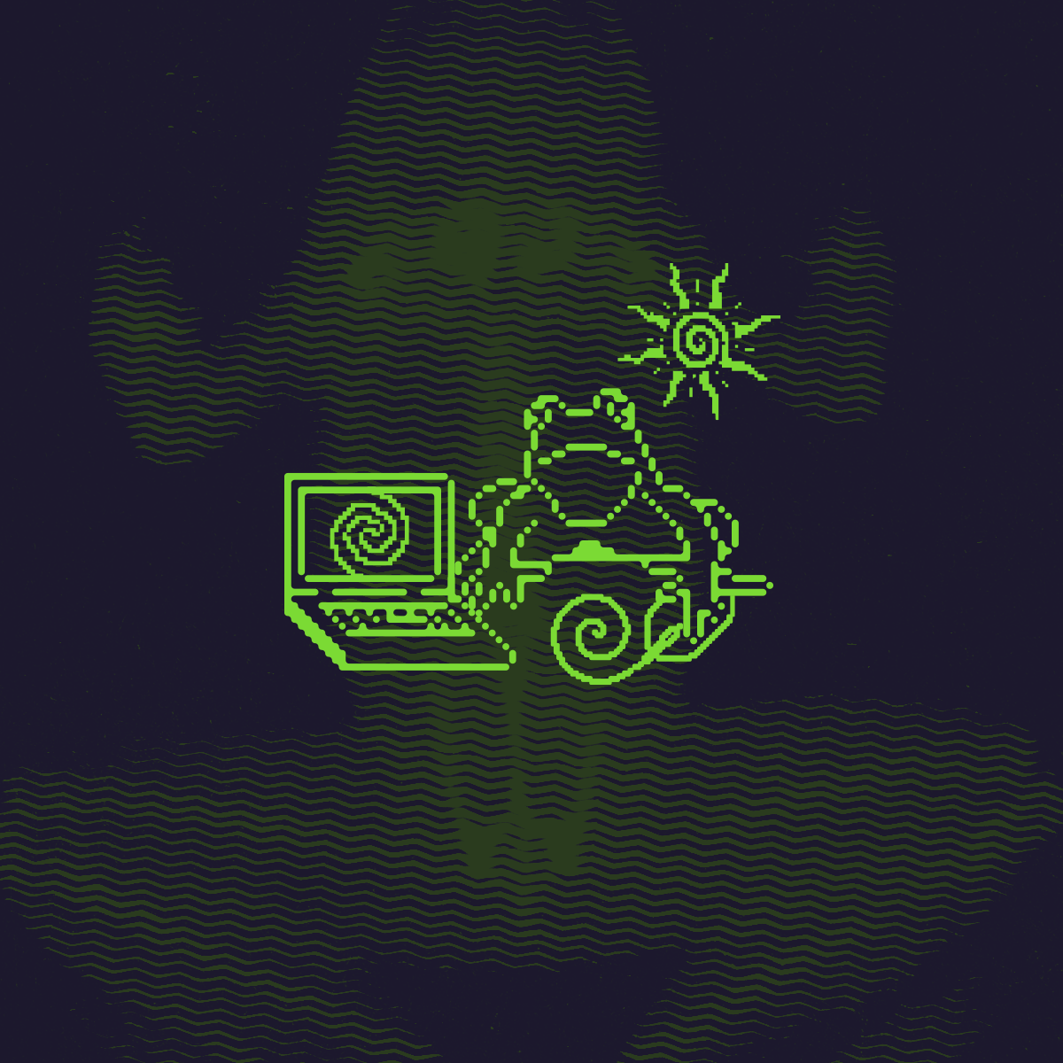
Misc. Logos
〰️
Misc. Logos 〰️