Art Direction
ginko village
A general goods brand with open concept offerings, sharing our lifestyle of homemade recipes, handmade and collected objects at adequate rates, and creative services for good causes.
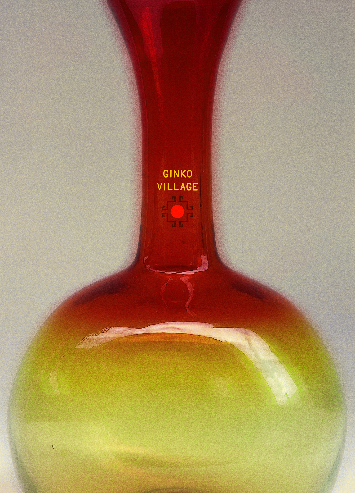
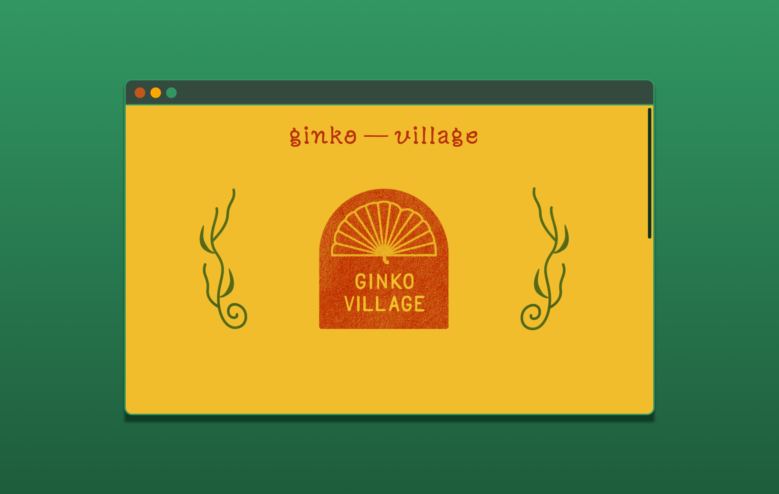
The ginkgo tree has been my favorite tree since I met my first one in the pacific-northwest. All humans have obsessions, mine was this ginkgo tree, more than a tree but a concept! The seed of the ginkgo significance was planted, and here is where that tree will grow! Coincidentally, our neighborhood in West Philly is filled with ginkgo trees that we can visit on our walks in the neighborhood. For the Ginko Village brand, it’s important to pay respects to beings that outlive us—with a ginkgo tree being a living fossil, I proposed this to be our main symbol.
The logo, featuring a ginkgo leaf silhouette, emphasizing the central outward rays that stem from its center stem, remind us that light shines within our centers if our resolve is longevity. The ginkgo symbol is placed within an arch, a classic symbol of transition and liminal spaces. In combination of the ginkgo within the arch, Ginko Village hopes to invite future-forward and curious minds into a welcoming space that provides exploration.
The visual direction for Ginko Village errs on bold, modern color with a handcrafted flair to shapes and imagery, bringing our eastern heritage to western product concepts, incorporating earthly, raw or recycled motifs. The deep and saturated colors support its mixed ornate counterparts, expanding its ability to tie in an expansive selection of inspiring symbols and imagery.
Ginko Village is a developing open concept shop created for the local West Philly community, using personal and found resources collected overtime to ensure we give space for experimentation and play, where low-consumption is revered and reusing is second nature. Our food & product line aims to be seasonal. We hope for our goods to be accessible to the community in its production process as well as its final product costs.
previously
💾
previously 💾

Amplify Education
Amplify Education is a print and digital education tech company, aiming to support teachers and students. My intention for art in Amplify Science & Math was about asset adaptability and fundamental art philosophies. I established some foundational goals with our visual language—clear and definitive shapes that are scalable in perspectives that suit the educational context, a color palette that is malleable to create an array of compositions, and sufficient contrast between focused primary objects and secondary background objects, whether by color or stroke details.

Brown State of Mind
Brown State of Mind worked to preserve and uplift the stories of traditionally marginalized cultures in Texas. I co-directed the organization with an art collective who gathered around visual art, music, and learning. Through my art direction, marketing, and brand strategy, we kept the visual concepts culturally relevant, authentic, and contemplative. As the organization collaborated with multitudes of creatives across disciplines, media and design from BSoM read classic newsprint with the Brown edge.